⚠️ Warning: this is an old article and may include information that’s out of date. ⚠️
The frontend engineer lives at the intersection between design and engineering, and this is perhaps nowhere more true than in the world of mobile. In order to make a usable desktop website, an engineer must have at least some sense of design, and fortunately a lot of this has been standardized over the years. But the world of mobile is full of more unknowns, and the field is changing rapidly, especially lately from the shift away from older feature phones to the focus on smartphones. As such, the mobile engineer has to be on their toes in the sense of both design and engineering.
The focus of this article is on mobile design in general. I’m by no means an expert, but these are some things I’ve found to be essential and basic topics. Hopefully you will find this useful!
Only one column?
Mobile websites should only have one column of main content. This point is stressed again and again in mobile design, and for good reason: the paradigm of multi-column layouts is fairly well-entrenched in desktop design, but it’s simply not an option for a well-designed mobile site.
To illustrate this point, the following two images are both 320 pixels wide, which is a common smartphone width in portrait mode. The image on the left is the Yahoo! front page (yahoo.com) in its three-column fixed width desktop size, and the image on the right is Yahoo! mobile’s front page (m.yahoo.com):


This might not be a fair comparison, as the desktop version isn’t optimized for mobile, so you can’t even read the text without zooming in. However, even if the size of the text was increased, it’s apparent that three columns is just too much, both because of screen width concerns as well as concerns about too much content. There’s simply too much information being crammed down the user’s throat. Chances are the user only wants to check a few things and then put the phone back in their pocket, and this three-column version of the site is preventing them from doing that.
Modules, modules, modules
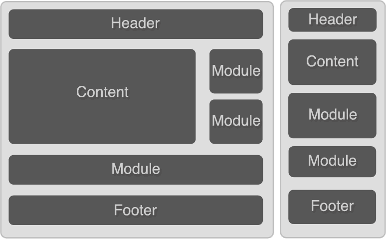
It’s helpful to think of a webpage as being composed of modules. If you’re converting a desktop website into a mobile site then you must essentially think of the website as bits of rearrangeable components:
 What you’re doing is essentially grabbing your most important components and making sure they appear at the top, then stacking each module on top of each other. And don’t forget we do have variable screen widths on mobile (even on phones themselves, since they can be either in portrait or landscape mode), so we should be sure that each module is taking up 100% of the available screen space. In more technical terms, yes, this means we have to make a fluid layout.
Clarity and concision
It’s important to be both clear and concise in presentation. On the desktop we can get away with a certain amount of screen bloat, but users always appreciate simple sites when they come across them. This is a huge part of what made Google so successful: users came to the site for one thing, search, and the site was kept simple to facilitate that interaction.
As it turns out, it’s quite hard to be clear and concise. I like to compare this to writing papers for school. Often we were given assignments that needed to be a minimum of X amount of words or pages, and it was sometimes challenging to find information to meet this minimum. Fortunately (or unfortunately) many students developed a highly refined skill of BSing to fill the word limit. But were you ever given an assignment where there was a word/page MAXIMUM? This turns out to be much harder to write for, mostly because you can’t BS it. You have to identify the fluff, the nonessential bits, and surgically remove them from your paper. (As a side note, in the area of computer science, notice how many HUGE tomes there are out there compared to smaller books. I would venture to guess that engineers have a hard time being concise.)
This is just the problem we now face with mobile. We know how to fill up webpages with fluff: add an RSS feed here, add a module that ties into Facebook there, add another feed here, stick a relatively unimportant module there, add an excessive amount of social sharing buttons, and presto, we have a website that looks pretty active. But how does that translate to mobile? The questions you’re forced to ask yourself are: “do I really need this data feed displayed here?”, “do I need this huge Facebook module here taking up space?”. Or more positive questions like “what are the things users will come to my site to check, and how do I make it easier for them to find those things?”.
In the case of the last question, it’s easy to see from the above screenshots what Yahoo mobile thought was most important: Mail, Search, and News, all of which are visible at the top of the page. Think about your website’s main two or three features and try to make those just as visible.
Useful links
W3C Mobile Web Best Practices 1.0
Tips and Tricks for developing Mobile Widgets
More from the Mobile Web series:
Part 1: The viewport metatag
Part 2: The mobile developer’s toolkit
Part 3: Designing buttons that don’t suck
Part 4: On designing a mobile webpage
Part 5: Using mobile-specific HTML, CSS, and JavaScript
Part 6: Dealing with device orientation
Part 7: Mobile JavaScript libraries and frameworks
Comments