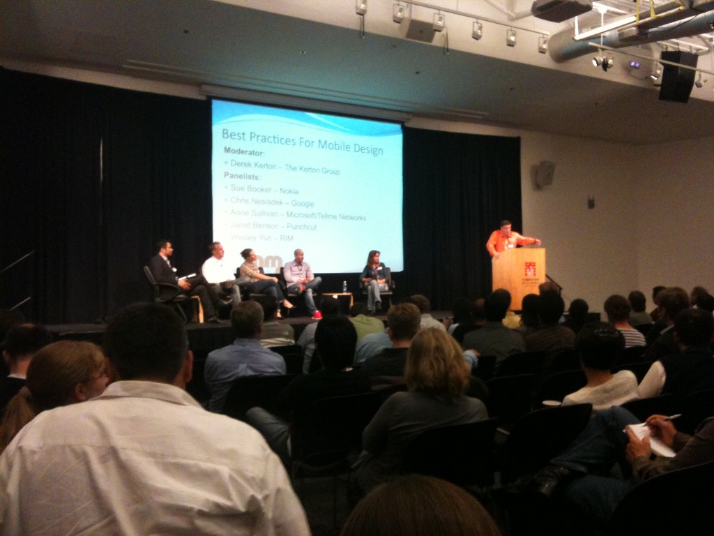
 Mobile Monday panel left to right: Wesley Yun (RIM), Jared Benson (Punchcut), Anne Sullivan (Microsoft/Tellme Networks), Chris Nesladek (Google), Sue Booker (Nokia) (taken with my iPhone 3GS)
I just came back from Mobile Monday Silicon Valley: Best Practices for Mobile Design at the Computer History Museum in Mountain View. This was a panel discussion with representatives from Google, Microsoft, Nokia, RIM, and Punchcut. There were quite a few little nuggets of wisdom which I tried to write down in bullet form:
Sue Booker, UED (Nokia)
- 1 trillion revenue worldwide from disabled users. 60m disabled users in the US.
- assume the user is multitasking
- apps will be used in totally unexpected ways
- not just physical disabilities.. also people in different situations or environmental limitations (no voice, no audio, limited bandwidth, etc)
- introduce new complicated functionality gradually. It’s easy to tell if it’s a new user or a repeat user, so slowly give repeat users more info.
- final takeaway: think of all types of users
Chris Nesladek, Commerce UI Lead (Google)
-
- keep it simple
-
- content is king
-
- make it fun
-
- make it fast
-
- do one thing as an experiment
- new UI challenge in the future: flexible screens?
- discoverability of new features… for an Android feature: link to video demo on vimeo
- final takeaway: designers, make friends with developers, because that’s how the best products get made
Anne Sullivan, UI Designer (Microsoft/Tellme Networks)
- her focus: designing for speech on mobile
- problem: discoverability of speech
- understand the capabilities and limitations of speech
- graceful degradation for speech: what happens when a voice command isn’t recognized?
- be transparent about what happens about processing in the background. For instance, geolocation. Allow the user to change or override this info.
- paper prototypes are very helpful
- discoverability of voice command activation is hard.. have to test on device itself (i.e. to find the right button placement, etc.)
- final takeaway: forget powerpoint! do presentations on the phone itself
Jared Benson, Design (Punchcut)
- iterate quickly
- no substitute for device itself
- final takeaway: involve designers from the beginning
Wesley Yun, UX (RIM)
- don’t make assumptions about touch interfaces (common gestures). The touchscreen is still pretty new, so not everyone is used to this yet
- don’t be too clever for your users. Think of users first, and do what makes sense.
- prototype and fail quickly. If you’re not failing, you’re not innovating
- make sure unusual new interaction isn’t a core functionality (for instance, four-fingered scroll)
- if you make something redundant, you’ve failed as a designer
- final takeaway: make it obvious to users
Comments