⚠️ Warning: this is an old article and may include information that’s out of date. ⚠️
Earlier this year I gave a talk (slides) outlining the latest and greatest in mobile performance, including a bit of my own unscientific research into carrier latency and bandwidth thanks to boomerang.js.
I realized that interest in mobile performance has exploded recently, especially with Steve Souders announcing his focus on mobile, and I thought it was time for an update, this time in blog form. Also, my old slides have been somewhat embarrassing. For some strange reason, at the time I wanted to give S5 a try - that outdated, ancient, not-performant slideshow framework. The result is a slideshow on performance that loads slowly… doh! (incidentally, I recommend deck.js as an alternative).
In any case, it was time for a roundup of mobile performance best practices, in blog form. I’m not sure if it’s properly called a manifesto, but it is what it is! Onward!
For fun: Latency and bandwidth tests
Before we start.. just a little fun data! It’s always been a pleasure to fiddle around with boomerang.js and compare results. With my latest trip to Japan, I had the opportunity to run Boomerang on Japan’s e-mobile 3G network in the remotest of places, up in Hakuba/Nagano in the Japanese alps.
When I got back, I ran the same tests from downtown San Francisco, which was closer to my California-based test server, and should’ve been faster, right? Theoretically…
Boomerang Tests (running on a California-hosted server)
| Verizon 3G (SF) |
| Latency |
| Bandwidth |
Yes, e-mobile didn’t have the greatest ping, but it handily beat ATT, even though it was going across the entire Pacific Ocean! Note that it came out the best in the bandwidth tests however…
(Note: it’s unknown if or how Steve Souders’s latest research affects these findings)
There’s a lot of factors that could’ve been involved, so look to something like OpenSignalMaps for more data.
Ok, onto the tips!
Page Organization
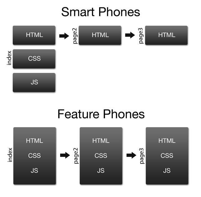
For feature phones that have little to no caching, aggressively combine requests (deliver HTML/CSS/JS all in one package). For smart phones, take advantage of caching by mirroring desktop frontend best practices: separate HTML, CSS, and JS so they can be cached (per-session and across sessions).
There’s old research about extremely small cache sizes on iOS in particular, but this research has been followed up on by more recent research by Ryan Grove (Yahoo!) and Steve Souders (Google), which shows that we shouldn’t be so paranoid, since caching is pretty decent across all the major mobile browsers.
Of particular interest is a browser’s capability to cache files in a current session, browsing from page-to-page, which is what most users will end up doing (caching of the page across sessions is another matter). What is the maximum file size a browser will cache during a session? The results (via Browserscope) end up being encouraging:
| Maximum Cache Size (MB) |
| Android 2.1 |
| Android 2.2 |
| Android 2.3 |
| Android 3.0 |
| Blackberry 6.0.0 |
| iPad 4.3.5 |
| iPad 5.0 |
| iPhone 4.3.5 |
| iPhone 5.0 |
| Opera Mini 4 |
| Opera Mini 5 |
| Opera Mini 6 |
| webOS 2.0 |
Avoid redirects (foo.com -> m.foo.com)
If possible, perform the redirection behind the scenes on the server, which should be transparent to the user. When a user performs a Google search and clicks on your page, they’re already getting redirected once by Google (check it yourself). Your own redirects are adding a second redirect where there need not be one.
Optimize Images
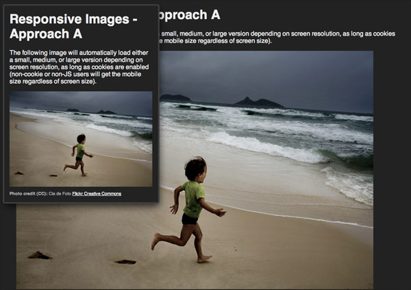
Deliver appropriately-sized images to devices. The philosophy of responsive design makes it easy to simply downscale images to fit the screen, but avoid this where possible, as this means wasted bandwidth.
You can optimize images through CSS media queries or in JavaScript (see below). Though you want to reduce your dependence on cookies, it may be a good idea to store these width/height values into a cookie (or localStorage if you are fetching images in nontraditional ways) so the values can be read by the server, which can deliver appropriately-sized images. This technique has been implemented by Filament Group, so you should probably read about their experiences before trying to roll your own.
Also note that where applicable, at the expense of performance you may want to serve higher resolution images for better screens, such as for Retina displays (which can be detected with JavaScript or CSS).
JavaScript examples
| |
(note that screen.width and screen.height are also available to tell you the dimensions of the entire screen, but this isn’t all available due to the space taken by the OS and browser chrome)
Media query examples
| |
navigator.connection (Android only)
Use navigator.connection if it’s available to serve different assets based on connection speed (3G vs WIFI, for instance).
Here’s the contents of the navigator.connection object (with a phone running on a 3G connection):
| |
And an example of how you could write code for each type:
| |
Here’s how we might be able to use Modernizr to help us out:
| |
We can now target special high-bandwidth assets with CSS:
| |
base64 encode small UI images
You can base64 encode binary image data in HTML and CSS:
HTML
| |
CSS
| |
There seems to be the mistaken belief floating around that base64 images aren’t cacheable. However, because you can embed them in your CSS, base64 encoded images will be cached along with the rest of your CSS.
You’ll probably just want to limit this to small UI icons however. I wrote a quick post on the drawbacks, and also a comparison with sprites.
If you’re using Compass/SASS, base64 encoding images is pretty trivial and easy to maintain with the inline-image helper.
Unicode and Emoji
☆ (HTML entity: #9734)![]() (HTML entity:
(HTML entity: #x1f468)
Before even considering base64 images, take advantage of icons that are already made for you: unicode characters and emoji (where supported). Keep in mind that these will look different across browsers, so this might not be an option for everyone.
Because of inconsistent implementations of Emoji character codes between Asian carriers, representatives from Apple and Google made a proposal to add Emoji to the Unicode standard. Unfortunately it seems that only iPhone supports them for now. Here’s a handy chart of all the Unicode emoji characters available.
Take advantage of CSS3
CSS3 offers many replacements for things we needed images for previously. RGBA values replace the need for a semitransparent image for overlays and such. Likewise, border-radius, box shadow, linear-gradients, radial-gradients all reduce the need for images.
However, do be aware that though phones support these new features, it doesn’t mean they’re necessarily ready for primetime. Something I’ve encountered recently to remind me of this fact is severe color banding issues when using a CSS radial gradient. The solution was to fake the radial gradient using two linear gradients, or to (unfortunately) use an old-fashioned image.
Avoid using cookies
Cookies get thrown into every request on a per-domain basis, so limit your usage of them. Use localStorage/sessionStorage instead, where possible.
App cache
Take advantage of the HTML5 app cache, though it’s an unwieldy beast to tame. This will mean you will need to make your site work offline, which might be tricky.
Assets that are traditionally cached get rechecked on page refresh (the server sends back a 304 response if your cache is still up-to-date). Whereas with the app cache, only one file (your manifest) is rechecked on page load.
Deferred JavaScript execution
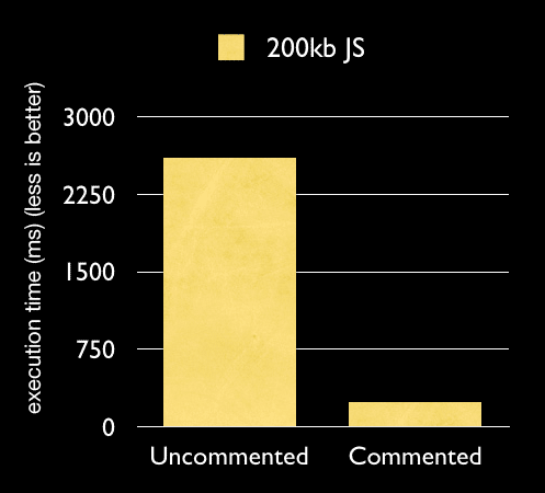
We know that deferring downloading of scripts is advantageous (by placing scripts at the bottom of a page or by using the async attribute), but deferred execution of JavaScript is even more important. Sure, we can use the defer attribute, but that’s only really relevant for when the page is loading (defer lets the browser know that the UI doesn’t depend on the JavaScript, so it can be safely deferred).
But what about JavaScript that runs after the page loads, such as XHR and JSONP requests? What does this mean for the user? It means that the UI freezes up unexpectedly when JavaScript is being downloaded and executed in the background. But this doesn’t mean that you want to completely avoid background downloading of JavaScript. The Gmail mobile team came up with a clever solution: by commenting all of their code and dynamically eval’ing it when needed, they split up the JavaScript downloading from its execution.
Perceived performance
Do whatever you have to do to let the user know that the UI is still responding. This sometimes means faking that something is happening. Communication is key! If they clicked on a button, give some indication that they clicked on it. If they clicked on something that requires a request to the network, show a spinner right away, even if it means you haven’t even sent out a request. The user doesn’t need to know the nitty-gritty details - they just want to know that their intent was communicated.
Onclick delay
On several major mobile operating systems there’s a several hundred millisecond delay on the onclick event. This is because of the double-tap-to-zoom functionality. When a user first taps on the screen, there’s a hard-coded delay that waits for the second tap. If there’s no second tap, the onclick event is then fired. Unfortunately the only way to get around the delay is to tap into touch events instead, which is a bit more complicated than it appears on first glance.
For an overview of some of the challenges of implementing the workaround, see this article by Google’s Ryan Fioravanti.
Take advantage of hardware acceleration
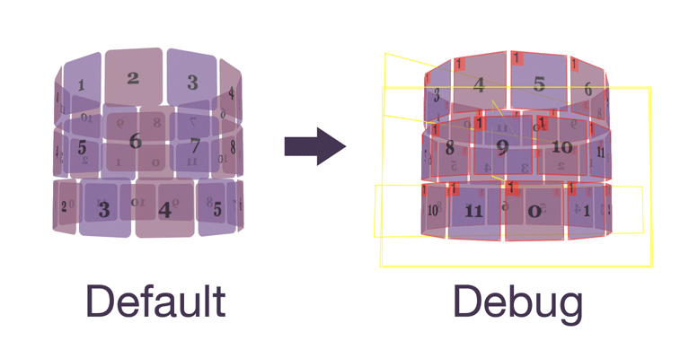
Use hardware-accelerated CSS transforms where possible (translate3d, translateZ, rotate3d, and scale3d). An element that is hardware accelerated is turned into a graphic, which is perfect for the GPU to manipulate, taking away the burden from the CPU.
However, the GPU isn’t all-powerful, so don’t try to apply hardware accelerations to everything. Also, these elements still need to be refreshed periodically, and it turns out that you can make some good optimizations here. First, you’ll want to debug the composited layers on your desktop browser:
Debugging hardware acceleration
- Type the following in the address bar: about:flags
- “Composited render layer borders” -> Enable
Safari
- Open a terminal
- $ defaults write com.apple.Safari IncludeInternalDebugMenu 1
- $ defaults write com.apple.Safari CA_COLOR_OPAQUE 1
- Open (or restart) Safari
- Debug -> Show Compositing Borders
(to turn these off, run the same commands with a boolean FALSE: i.e. defaults write com.apple.Safari CA_COLOR_OPAQUE FALSE)
Keep in mind that each composited layer has a limited width and height. For instance, if you’re creating an image carousel, chances are the dimensions of the element will be too big to fit the layer into memory as one piece. This means that when the element is animated, the GPU has to break up the layer manually into several manageable chunks. It’s much better to chunk it yourself. To do this, you trigger hardware acceleration on each chunk.
So you will change this:
| |
To this:
| |
Where carousel-pane represents each child element of the carousel.
More info: (slides) WebKit in Your Living Room (Matt Seeley, Netflix)
Also see HTML5 Techniques for Optimizing Mobile Performance.
HTTP Pipelining
Take advantage of HTTP Pipelining, which is often overlooked, but has broad support on mobile. This virtually eliminates round trip times, for all but the first request.
Opera and Android support pipelining, and the newly released iOS 5 has added support for it.
Great! So how do you make sure your server is taking advantage of pipelining?
The first request to every server is sent by itself (only one request on the connection), and the browser looks for two properties in the response:
- Use of HTTP/1.1
- An explicit “Connection: Keep-Alive” header (required by Android)
If these criteria are met, subsequent requests will be pipelined. Sweet!
DNS Prefetching
Take advantage of DNS Prefetching. This theoretically speeds up load times, but there have been some issues, so be sure to test it.
To turn off DNS Prefetching, serve this meta tag:
| |
You can also explicitly force a DNS lookup:
| |
Avoid library code bloat
If you’re developing for smart phones, you may be able to dramatically reduce the data over the wire by simply using new JavaScript APIs instead of a full-blown library or framework such as jQuery Mobile (which is rather a UI framework and depends on the desktop version of jQuery).
Among the things offered by newer browsers, which should reduce your dependence on a library:
- querySelector/querySelectorAll: CSS selectors that replace the need for a selector engine
- getElementsByClassName
- classList - replaces the need for hasClass, addClass, removeClass helpers (available on iOS5, but not sure what else)
- XMLHttpRequest - it’s probably time to learn how to do this natively instead of using a wrapper that takes care of IE’s old implementation that requests an ActiveX object. Cross-Origin Resource Sharing also means we can easily share resources across domains.
- HTML5 history (pushState, etc) - though an older bug means you should maybe hold off for now (note: the fix is present in iOS 5, which is based on a newer WebKit)
- HTML5 Form Validation reduces our need for JavaScript-based validation
- HTML5 input types that reduce our need for custom UI controls (date, time, slider [range], etc)
You’ll want to consider using either a library that was optimized for the browsers you’re targeting (such as Zepto.js) or simply bring in a microlibrary for specific tasks you want to perform.
Clientside databases
Most mobile browsers currently support WebSQL, which is being phased out in support of indexedDB, which is not widely implemented. However, if you use a wrapper such as Lawnchair, the transition from one to the other is relatively painless.
TODO: testing
More
(to be expanded on later)
- use standard desktop best practices (for smart phones)
- requestAnimationFrame instead of setTimeout
- setImmediate (where available) instead of setTimeout(fn(){},0)
- Ajax parsing times: you might want to use Multipart XHR so you can yield the process as it’s going through big responses (to prevent the UI locking up)
- avoid rgba, box shadows, text shadow, etc, as this greatly degrades performance (especially on animations)
- high resolution screens may suffer from animation/transition slowness - it’s been shown that manipulating the viewport tag to scale the page will speed up canvas rendering, and high-dpi scaling concerns are also evident in CSS transforms
- WebKit animations are faster than animations done via JavaScript
- if you do use JavaScript-based animations, limit the UI updates to ~17ms, which is equivalent to 60fps, which is the fastest your display will refresh anyway, so it’s pointless to try to do anything faster than that. Keep track of the time since the last UI update and don’t do anything if 17ms haven’t passed.
On the horizon…
- SPDY: already implemented in Amazon’s Silk browser for Kindle. Will possibly be on Android phones when the browser is powered by Chrome
- indexedDB replacing WebSQL
Tools
Mobile Perf bookmarklet
pcapperf (Packet Capture Web Performance Analyzer)
Blaze Mobitest - tests the loading time of your site on actual phones
More Resources
Mobile Web Application Best Practices
Mobile Performance (Steve Souders)
Strangeloop Web Performance Hub / Mobile
(odometer image via henrybloomfield on Flickr)

Comments